
Drawing a Production Possibility Frontier
The best way to explain how to draw a production possibility frontier is to look at a simple example. Let’s imagine an economy that only produces two goods: burgers and hot dogs. These two products (i.e. the burger and the hot dog industries) together use all the economy’s available factors of production.
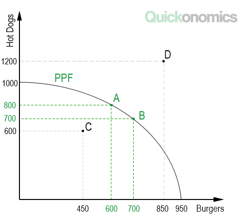
If all available resources are used to make burgers, the economy can produce a total 900 burgers and 0 hot dogs. By contrast, if all resources are dedicated to the production of hot dogs, the economy can produce 1,000 burgers. These two extremes mark the end points of the production possibility frontier. That is, they indicate the x-intersect and the y-intersect of our curve (see below).
Of course, the economy can also decide to divide its resources between the production of burgers and hot dogs. There are countless combinations of the two goods that can be produced at full capacity. To draw the production possibility curve, we can plot a few of those combinations in the diagram and simply connect them to get the full PPF.
For example, let’s say our economy can produce 600 burgers and 800 hot dogs (Point A). Alternatively it can also produce 700 burgers and 700 hot dogs (Point B). If we plot these points in the diagram (see below) and connect them with the x-intersect and y-intersect, we can approximate the full PPF. Note that the more points we have, the more accurate our PPF will be.
Production Possibility Frontier and Opportunity Costs
As mentioned above, the production possibility frontier is a beautiful illustration of opportunity costs. It shows the trade-offs companies or individuals face when they have to decide how to allocate their limited resources between two alternatives. Or in other words, the PPF shows, how much of good A must be given up in order to get more of good B and vice versa.
For example, if we take another look at the illustration above, we can see that the economy has to give up 100 burgers if it wants to increase production of hot dogs from 700 to 800. Thus, the opportunity cost of these 100 burgers is exactly 100 hot dogs. Similarly, to increase production of burgers from 0 to 600, the economy has to reduce production of hot dogs from 1000 to 800. Hence, at this point the opportunity cost of 600 burgers is 200 hot dogs.
Pareto Efficiency
In addition to opportunity costs, the PPF also illustrates the concept of Pareto efficiency. According to this concept, an economic output is efficient when it’s impossible to make one party better off without making another party worse off. Or in our case, when it is impossible to produce more of Good A without producing less of Good B.
This holds true for all points that lie on the PPF. Because the PPF marks the maximum output combinations, it is not possible to increase the output of one good without reducing the output of the other. Meanwhile, all points below the curve are considered inefficient, because in those cases total output of both goods can be increased at the same time, which means the economy is not operating at full capacity (i.e. efficiently). Finally, all points above the curve are impossible to reach, because they would require a higher production capacity. Hence the name, production possibility frontier.
For example, it is not possible for our imaginary economy to produce any combination of hot dogs and burgers above the PPF (e.g. Point D), because there are not enough resources available to reach this output. However, the economy is not working at full capacity when it produces an output below the PPF, like Point C. In this case, it could still increase production of burgers without producing fewer hot dogs and vice versa.
In a Nutshell
The production possibility frontier (PPF) is a graph that shows all maximum combinations of output that an economy can achieve, when available factors of production are used effectively. The PPF illustrates how much of a good or service must be given up in order to get more of another good or service. In addition to that, the PPF also illustrates the concept of Pareto efficiency. All points that lie on the PPF are pareto efficient, whereas all points below the PPF are considered inefficient.